Creating a peaceful and calming atmosphere at home starts with the colors you choose. Colors have a powerful effect on our mood and energy, so selecting calming tones can help transform your living space into a relaxing sanctuary. Whether you want to refresh a single room or redesign your entire home, understanding how to pick calm colors will make a big difference.
In this post, we’ll guide you through practical tips to select soothing hues, use them effectively, and create a harmonious environment that feels just right.
Why Choose Calm Colors?
Calm colors are typically soft, muted, and easy on the eyes. They help reduce stress and promote relaxation, making them a great choice for bedrooms, living rooms, or any space where you want to unwind. Unlike bold or vibrant colors that energize, calm colors offer subtlety and comfort.
Understanding Color Psychology
Before choosing your palette, it’s helpful to know how different colors influence mood:
– Blues: Often associated with tranquility and stability, light blues can create a serene environment.
– Greens: Linked to nature and balance, green shades help foster a refreshing space.
– Neutrals: Soft grays, beiges, and off-whites provide a clean, peaceful backdrop.
– Lavenders: Light purples or lavenders can promote calm and creativity.
Avoid overly bright or intense colors if your goal is to relax, such as neon or vivid reds and oranges, which tend to stimulate and energize.
Tips for Choosing Calm Colors
1. Start with Natural Inspiration
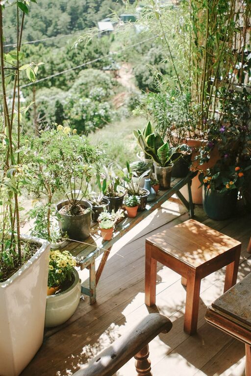
Nature is a great starting point for calm colors. Think of seaside blues, forest greens, or sand tones. These naturally calming colors evoke feelings of peace and help create a soothing atmosphere.
2. Pick a Base Color
Choose a main color that feels calming to you. This will be the foundation of your palette. Use it for large surfaces such as walls or carpets.
3. Add Complementary Colors
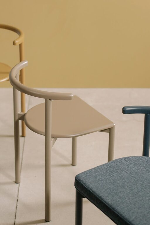
To keep the room interesting, add one or two complementary hues. For instance, soft beige pairs well with pale blue, while muted olive green works nicely with warm off-white.
4. Choose Matte or Satin Finishes
Glossy finishes reflect light sharply and can sometimes feel harsh. Matte or satin paint finishes absorb light softly and contribute to a tranquil look.
5. Test Before You Commit
Lighting affects how a color looks in different rooms. Test paint samples on your walls and observe them at various times of day before making a final decision.
6. Consider the Room’s Purpose
Choose colors based on the function of the room. Bedrooms and meditation areas benefit from cool blues or gentle greens, while a living room might include warm neutrals and soft accents.
7. Use Color Psychology Wisely
Combine calming colors with elements like natural wood or soft fabrics. This balance enhances the comforting effect.
8. Limit High-Contrast Elements
Avoid placing dark colors next to very light colors in a way that feels sharp or jarring. Soft transitions help maintain a peaceful feel.
How to Incorporate Calm Colors in Different Rooms
Living Room
Use soft neutral walls paired with pastel blues or gentle greens in cushions, rugs, or artwork. Keep furniture colors muted and select accessories that complement the color story.
Bedroom
Light shades of blue or lavender are ideal for walls or bedding. Layer different textures and fabrics in matching tones to build depth without overwhelming the calmness.
Bathroom
Cool, lighter shades such as seafoam green or soft gray can make bathrooms feel refreshing and spa-like. Keep decorations simple and minimal.
Kitchen
Consider muted warm neutrals for cabinets or backsplash, combined with subtle green accents to evoke freshness while maintaining a calm atmosphere.
Common Mistakes to Avoid
– Choosing colors that are too dark: While darker colors can be cozy, too much dark paint can feel heavy or gloomy.
– Ignoring lighting conditions: A color might look soothing in natural light but too dull or lifeless in artificial lighting.
– Overusing one color: While minimalism is peaceful, too much of one color without variation can feel monotonous.
– Forgetting personal preference: Colors should feel comfortable to you since you’ll be spending your time there.
Final Thoughts
Selecting calm colors is about creating a space that invites you to relax and recharge. Start with natural inspiration, consider the room’s purpose, test your ideas, and balance shades thoughtfully. With these tips, your home can become a haven of peace and tranquility—one color at a time.
Feel free to experiment with different hues gently, and remember that the best calm colors are the ones that make you feel most at ease in your own space.